Dropbox redesigns logo in more popart color hues
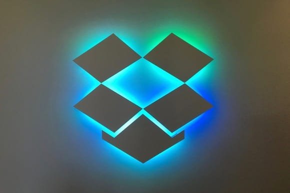
Dropbox is more colorful and extravagant than any other time in recent memory. Not the monotonous blue and white but more multi colored. We see that it is more inspired by Warhol’s pop art scheme of colors.
Dropbox has redone its image and has turned out to be colorful with the incorporation of significantly more hues. This is the organization’s initial major update following 10 years. It now has significantly more hues dissimilar to the past white and blue box curbed barely detectable logo. The new logo is presently more flat.
Dropbox aims to lure in younger audience with captivating designs
With its new outline and design, Dropbox is planning to emerge more among its rivals including Box, OneDrive and Google Drive. Also, the organization believes that the new hues will make its clients more imaginative.
Read: Logo Inn Creates Logo Design
“As our mission has evolved from keeping files in sync to helping keep teams in sync, we realized our brand needs to change, too. Our new brand system shows that Dropbox isn’t just a place to store your files—it’s a living workspace that brings teams and ideas together. The look is expressive, with vibrant colors, rich imagery, a versatile typeface, and playful illustrations. We’re excited to share it with you.” Says the organization.
As per the organization, the shade of the new logo will change as indicated by the circumstance yet we don’t know what a “circumstance” could be in a document sharing service. Possibly it’ll get the hues from pictures.
“Our new system juxtaposes color pairs in bold, unexpected ways. Color is dynamic and playful—especially when it comes to the new logo, which can change based on the situation.”
Read: Google Pixel XL2 unveiling Today Officially—leaked full specifications beforehand
Image via csoonline
RS News or Research Snipers focuses on technology news with a special focus on mobile technology, tech companies, and the latest trends in the technology industry. RS news has vast experience in covering the latest stories in technology.


