Fitbit’s new app looks quite similar to current one
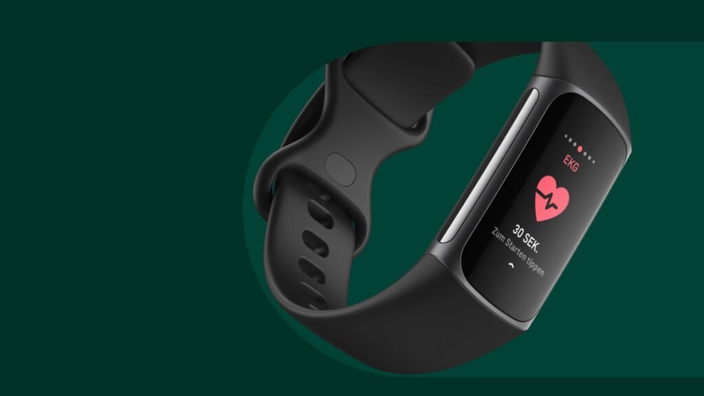
With the collapse of the app’s well-liked community features known as Challenges and Adventures last month, we witnessed some of the first significant changes since Google formally seized control of Fitbit. Additionally, the business stopped supporting Deezer and Pandora in March and announced intentions to make it mandatory for all current Fitbit app users to switch to utilizing their Google Accounts as of last week. It’s a lot, so you might be wondering what the Fitbit app’s future holds. Thanks to updated screenshots of the app posted on the business’ website, we now have a partial response.
As spotted by 9to5Google, there are a bunch of screenshots contained in the help article that will guide you on how to use the app. Although these guided images are from an IOS design, we can hope for the Android version to be like that.
The completion rings on the lower cards for measuring things like how much water you drank or how long you slept last night appear to be somewhat squared after the upgrade.
Instead of a carousel of smaller photos, the Discover page now employs expansive cover images. For those, a Health and Wellness page enables you to add details to the Today tab, such as your weight or heart rate.
You can “reach your goals faster with expert guidance, structured plans, and tips” by visiting the Guided Programs area. Overall, there isn’t much of a departure from the existing layout.
9to5 Google notes that the screenshots first debuted alongside Fitbit’s new Wear OS user interface in the Play Store along with App Store back in January. Given that we’ve already seen them twice, there’s a very good chance that this is close to what Google will eventually release. Also, you may anticipate that release to be rather soon given that the displays are currently included in the help instructions.
RS News or Research Snipers focuses on technology news with a special focus on mobile technology, tech companies, and the latest trends in the technology industry. RS news has vast experience in covering the latest stories in technology.


