Google’s Gmail mail service is undoubtedly one of the most important offerings from the California search engine giant and on the web as a whole. Gmail is correspondingly well-known, and the logo of an M, which is reminiscent of an envelope, is known to many.
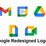
But the Gmail-M is being retired, at least in its previous or current form. Because as per reports, Google will replace the “iconic” envelope logo with a new one that better fits the rest of Google’s designs. This means that the new M takes up the colors of the Group’s main logo (and adds dark red).
This also means that the new Gmail-M stands in a row with the logos of Google Maps, Google Photos, Chrome, and other products of the group. Fast Company describes how difficult a logo change can be: Because there you have details on how it came about. So Google has considered eliminating the M altogether as well as deleting the typical Gmail red.
In the course of user surveys and other studies, however, Google discovered that the M is essential, but not the envelope. That is why the M has now been designed as it will be seen everywhere now or soon. However, the new logo does not only have friends: Many believe that it cannot be distinguished from other logos of the company and if you put all the blue/green/red/yellow variants next to each other, then there is certainly something to it–no matter what logo design file formats the new design is saved as and viewed in.
The redesigned Gmail logo isn’t everything. Because in the course of the changes, Google has also renamed G Suite. The new name is Google Workspace and certainly better represents what this package of offers actually is, namely a collection of essential tools for work. That was certainly a background for the redesign of Gmail, as the old logo of the service would have looked like a foreign body next to that of Drive, Docs, and Co.
Digital marketing enthusiast and industry professional in Digital technologies, Technology News, Mobile phones, software, gadgets with vast experience in the tech industry, I have a keen interest in technology, News breaking.