Google Discover gets the new three-column UI design for tablets
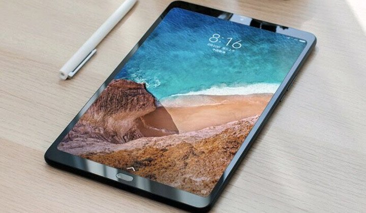
In the mid of the year 2021, the tech company Google launched the Android 12L. The Android 12L was specifically introduced to strengthen the company’s devotion to Android devices with big screens. The Android-based large screens include foldable smartphones and tablets. In addition to this, the company has previously stated that it will introduce more than 20 first-party apps with UI optimized for tablets. Keeping by its words, now the company is all set to introduce one of the first-party apps having tablet-optimized UI. Reportedly, the company has worked on the multi-column UI mode for Google Discover.
The Google Discover section is presented on the left side of the screen. The recent development is introducing a three-column UI design to the app. The UI design is presented in landscape mode. In the past, the app was featured with two columns of news articles. The rest of the space was left blank. Given the latest design, the space on the screen is used in a better way. The Google logo as well as the Google account picture has been relocated to the left and right corners of the screen. This is done in order to maximize the space on the screen. This is what is presented with the landscape mode. However, the portrait mode features two columns of articles.
Besides this, the Google Search app has also received the updated UI design for the landscape mode. In this UI mode of the app, the navigation rial is featured on the left side of the screen. However, the navigation rial is lacking the Material You design theme. Do note that the new UI for the above-mentioned apps is presented to devices that are based on Android 12L and Android 13. You can enjoy the new UI design on your Galaxy Tab S8 series.
Many apps from the company have received this new UI design. However, the company plans to introduce tablet-optimized design to various other apps. Besides this, the company is urging multiple third-party app developers to come up with multi-column UI for their respective apps in order to better utilize the screen and enhance productivity. Aside from Google, Samsung has introduced a similar UI design for its own apps.
Research Snipers is currently covering all technology news including Google, Apple, Android, Xiaomi, Huawei, Samsung News, and More. Research Snipers has decade of experience in breaking technology news, covering latest trends in tech news, and recent developments.
