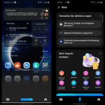
While Samsung is ready to end support for some of Bixby’s AR features, the South Korean company doesn’t plan on giving up on its virtual assistant for now. Samsung is now rolling out an update for the voice assistant that introduces an updated icon and a complete visual redesign. The new Bixby update has already started rolling out to users, and it looks like a cross between the minimal Google Assistant UI that was introduced last year and Siri on iOS 14.
As you can see in the video shared by u/MehdiMa0507 on Reddit (linked below), the updated Bixby interface no longer covers the entire page. Instead, the Bixby UI now only appears in a small section at the bottom of the page with a faded background similar to Google Assistant. The old Bixby icon has also been replaced with a flatter alternative that switches to a horizontal bar when the voice assistant is listening for your command.
Samsung has also updated the Bixby page with a bottom navigation bar that shows three icons — a keyboard icon to issue text-based commands, a mic icon to use voice commands, and a new home icon. The color scheme for the page has also seen a refresh from different shades of blue to black/gray. The updated Bixby UI is likely part of the Bixby Voice 3.0 update, which is currently rolling out to users running both One UI 2.1 and One UI 2.5. But the update doesn’t seem to be available for all users currently. Sideloading the updated APK from APKMirror also doesn’t work on my Galaxy Note 20 Ultra running One UI 2.5 and Mishaal’s Galaxy S20 running One UI 3.0 beta.
Research Snipers is currently covering all technology news including Google, Apple, Android, Xiaomi, Huawei, Samsung News, and More. Research Snipers has decade of experience in breaking technology news, covering latest trends in tech news, and recent developments.