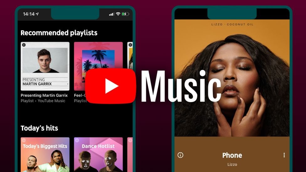
The gradient backdrop for the Now Playing tab is being tested by YouTube Music

During the course of the past few months, YouTube Music has received several design modifications. With each new design tweak, the app gained more modernity. Recently, the Apple HomePod received support for YouTube Music. According to some recent pieces of information, the app is now set to receive another design change. The information suggests a redesign for the new Now Playing tab. Reportedly, the tab will swap the solid background with a gradient backdrop.
Presently, the color of the background depends on the album art. With the new upcoming feature, the gradient background for the Now Playing tab will offer more colors at the top; however, the bottom will appear darker. Moreover, the colors are reportedly muted in order to avoid merging with the album art.
The new feature isn’t rolling out widely
Due to the new redesign, the play/pause, next/back, shuffle, and repeat buttons are now more prominent against the backdrop. Well, this is not the only feature that is under testing. Reportedly, buttons like Up Next, Lyrics, and Related won’t be found on the app’s bottom inside a separate box. Rather, they now appear as simple text and floats. Well, it kind of gives off a messy look.
However, they can still be accessed at the bottom by swiping up. The YouTube Music Now Playing tab gradient backdrop for Android appears to have not yet been widely released, despite numerous user reports to the contrary. Overall, the music streaming app feels different thanks to this modest update.
Research Snipers is currently covering all technology news including Google, Apple, Android, Xiaomi, Huawei, Samsung News, and More. Research Snipers has decade of experience in breaking technology news, covering latest trends in tech news, and recent developments.


