Instagram or Instagzam? Users scoff at the new Insta logo
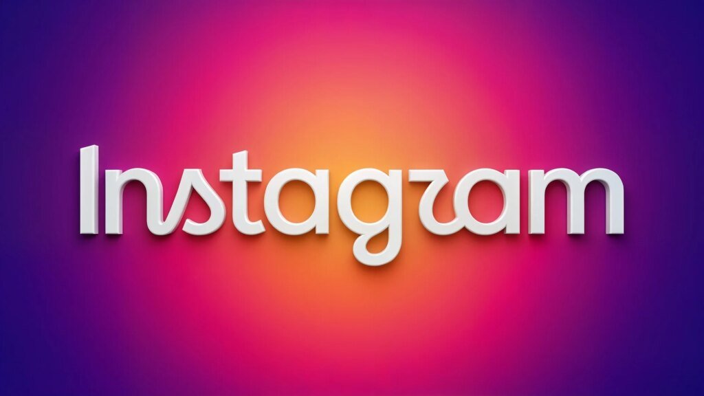
Meta is giving Instagram a new text logo for the first time in ten years. The unusual mix of script and print is intended to appear modern, but it causes ridicule from users. The sometimes poor readability is heavily criticized.
New lettering in the app
The name at the top of the screen, which was previously written entirely in cursive, is giving way to a new variant. Platform boss Adam Mosseri justifies the move with the desire for a visual refresh. The result is a cleaner and more modern appearance that is still reminiscent of the original, but appears more contemporary. Visually, the new design is an unusual mix of print and cursive. While some letters remain fluidly connected to each other, others are completely isolated. The design of the letters R and S in particular causes irritation as their lines end abruptly and are difficult to read in the new font.
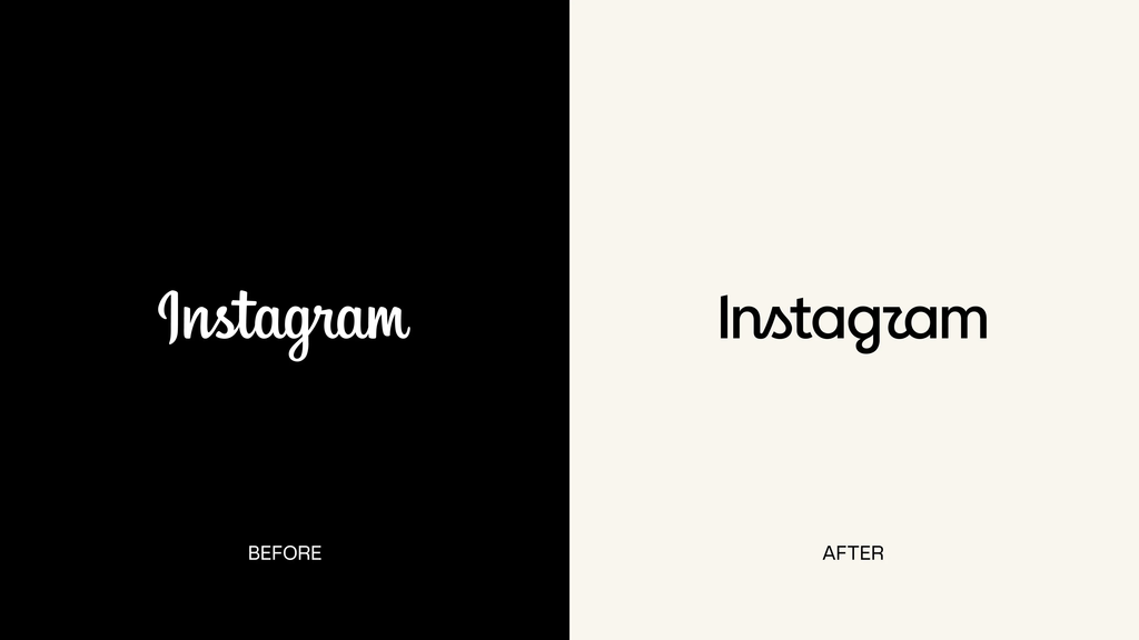
Users scoff at design
As can be seen on social media, the feedback from users is very mixed. In the Comment columns mocking comments pile up. Many people say that the new logo looks more like Instagzam or Instaguam because of the oddly shaped R. One user noted that the word now seemed like a toddler would say it. In addition to the visual criticism, some users express concerns about accessibility, as the poorer readability is an obstacle for people with visual impairments. At the same time, many commentators use the opportunity to point out deeper problems with the platform. The points of criticism include a lack of filters for AI-generated content, inadequate measures against spam bots and unfounded account suspensions without real support.
Worldwide distribution begins
Adam Mosseri expected strong headwinds in advance because he explicitly asked for critical opinions about the new design on other platforms. Proponents of the adaptation, however, praise the fresh look, which remains true to the original character and represents a logical further development.
Important for all end users: The familiar camera symbol, which serves as an app icon on the home screens of smartphones, remains unaffected by the change. The new logo will be delivered gradually and worldwide over the course of the rest of the year. So it will take some time before all accounts see the new design on their screens.

Amit Gohar is Technical writer at ResearchSnipers.com, he is well versed Technology News writer, he has completed is MS computer Science in 2020. He can be reached at amit.g@researchsnipers.com