Google’s Phone app brings a latest in-call interface
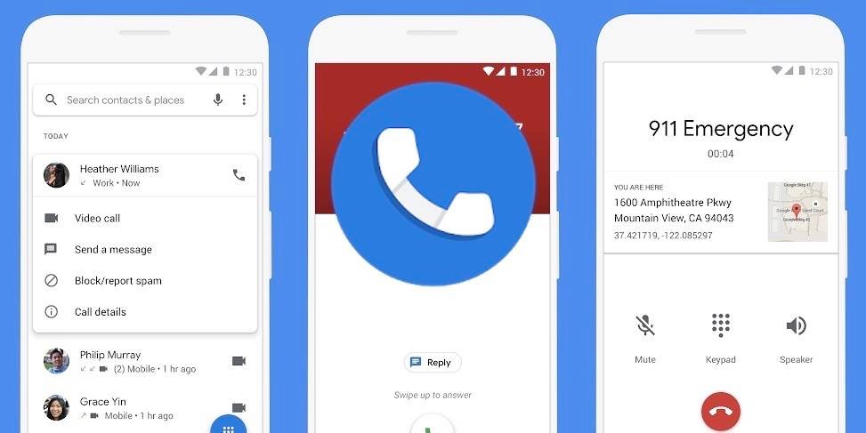
Mobile phones and its applications have carved their way towards advancement. However, there is a basic feature and can be depicted as a core function that cannot be replaced is of making calls. Google’s phone app is one of the best among this list as it provides a whole lot of features like Call screen, Hold for me and clear calling that are some of the best features regarding phone calls. Because of these features pixel devices are ranked at the top among Android phones. With advancing technology and trending styles, every app is considering making their look and features pleasant. Google is ready to role out its latest feature that will be updating phone’s app in call UI.
New in-call interface
The profile photo, name, and contact number are all displayed at the top of the interface in the latest version, while the red call-ending button is placed at the bottom. As per information from 9to5Google, the location of the in-call options, including mute, keypad, audio output, and call recording. These may now be accessed by a card that appears from the bottom, and by default, just three options are displayed: Keypad, Mute, and the audio output selector.
More possibilities appear in a row above when you tap the card’s three-dot More button. Moreover, the keypad appears to be an extension of this card. According to Google’s Material You design standards, the call interface and card background are likewise dynamically styled.
All the in-call utility options were located in the center of the screen on the previous UI, although it frequently took two hands to use. The keyboard is actually a little bit higher now, so the new card-style structure should be considerably more practical for one-handed use, at least with respect to the call options. The fact that all buttons are now a part of the same overlay alone qualifies as a visual improvement.
With version 98 of the Phone app in the stable channel, the new call interface is widely releasing, and we have it on a number of our devices. Even on version 98, it appears that the adjustments for Pixel phones need more server-side updates to take impact. If you have the new in-call interface, you may also notice that the floating bubble has been replaced by a new pill-shaped call duration counter in the status bar when using other apps while on a call.
Even though it’s a small element, it makes it slightly more difficult to reach your current call. On the other hand, the floating indicator was extremely distracting, so some people could view it as a good improvement.
RS News or Research Snipers focuses on technology news with a special focus on mobile technology, tech companies, and the latest trends in the technology industry. RS news has vast experience in covering the latest stories in technology.
