Microsoft Teams Get A Refreshed Design
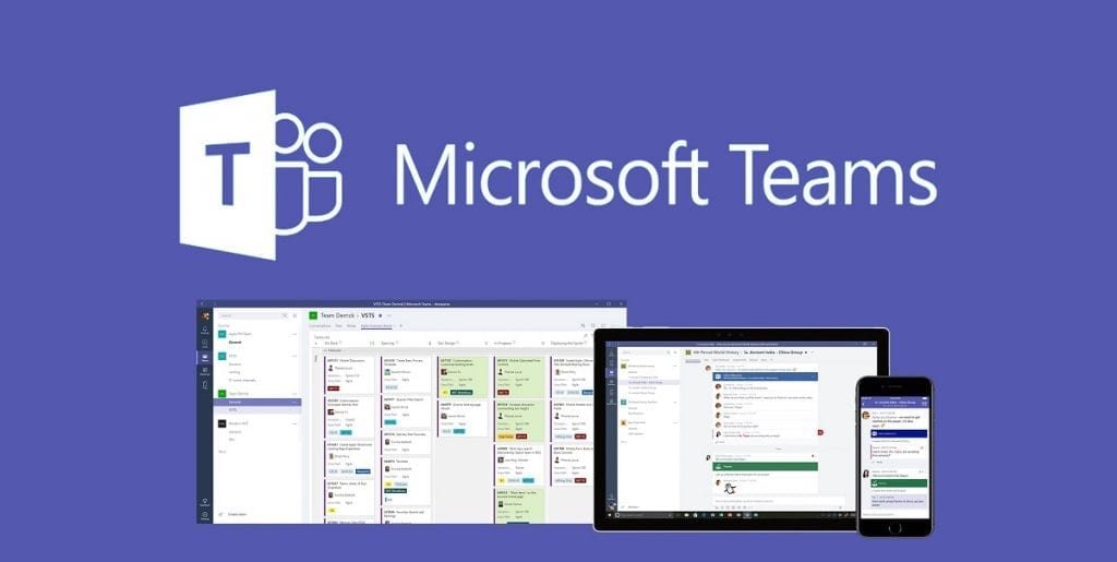
Microsoft has now started to deliver some design changes to the users of its communication platform Teams. These now receive more of the modern-looking fluent design and a more extensive dark mode.
According to a report by WindowsLatest, the innovations come with version 1.4.00.4167 of the Teams client and do not seem to be immediately received by all users. Microsoft is probably scattering the update a bit here, but it shouldn’t be a long process. The step primarily ensures that the application fits better into the entire Windows 10 and Office 365 ecosystem.
The design refresh primarily affects various buttons for conversations, meeting notes, participants and others, which are now given rounded icons. The left navigation bar also gets a slight shadow, which is especially visible or really noticeable in the light theme.
Not always automatically
The new features mentioned should sound familiar to some users. Because they were already given to various testers in January as part of a public preview of the team client. Microsoft had only introduced its own program for testing new features this year, as is already known from various other Microsoft products.


With the design update, users also receive an improved dark mode, which is now a little darker. The changes primarily affect the background, but some too bright colour nuances have also been removed, which stood out too strongly on the dark and subtle surface. The changes should appear automatically for the Teams users. However, there is also feedback from some users that the improved dark theme only becomes active when you briefly switch to the lighter design and reactivate dark mode.
Digital marketing enthusiast and industry professional in Digital technologies, Technology News, Mobile phones, software, gadgets with vast experience in the tech industry, I have a keen interest in technology, News breaking.