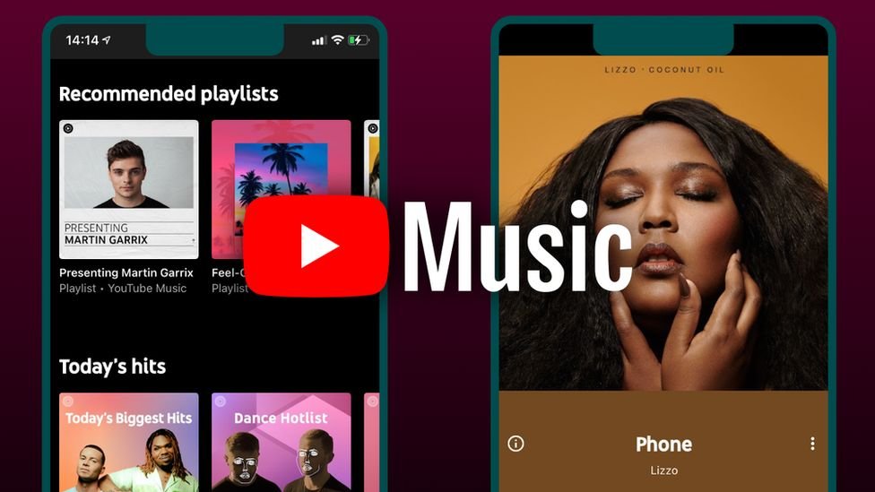
YouTube Music introduces a new user interface with time-synchronized lyrics.

When it comes to streaming music, everyone wants the best choice for them with a vast variety of options. Every streaming app provides quite similar features, including a library containing music. There are quite a few amendments that differentiate them from each other. However, when compared to Spotify or Apple Music, YouTube Music still offers a lot of features that the other two apps do not. Following its uniqueness, YouTube Music is ready to roll out a new feature called time-synced lyrics, which are provided when the app is used on a compatible device.
How the feature actually works!
According to information from Reedit, a user shared the experience of seeing the new feature in action. However, we didn’t get that detailed a review of the experience, but the user said it reminded them of a feature of Apple Music’s lyrics UI. The feature works as follows: when you play the music, the album display shifts to the left, and you can see the lyrics displayed on the right side of your screen. Furthermore, the album cover is displayed in a blurred manner in the background, and the song lyrics continue to sync with the music.
The feature is currently not compatible with every device. A great experience is being provided by the app, but it’s not working on our smartphones and tablets just yet. Workers (from 9to5Mac) have tried to test the feature, but it doesn’t work out on some devices. We can hope for the feature to be rolled out for every device and for its availability without casting.
RS News or Research Snipers focuses on technology news with a special focus on mobile technology, tech companies, and the latest trends in the technology industry. RS news has vast experience in covering the latest stories in technology.


