Apple Has Changed App Store Icon Triggering Mass Criticism

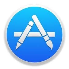
The news is that Apple is changing its App Store Icon. Previously the icon had a design of a pencil, paintbrush, and ruler which when arranged gave a look of the letter “A”.
Now the new icon of App Store has raised eyebrows, many people feel that it looks more like popsicle sticks.
Users feel that the original icon was much better and simpler. As the new icon removes the shape of pencil, paintbrush, and ruler, it leaves much to the individual’s interpretation.
https://twitter.com/stroughtonsmith/status/897145699011264513
And this was a level of sarcasm
Hey look I found the new App Store icon on my lawn. pic.twitter.com/2eFZJBF2fX
— Becky Hansmeyer (@bhansmeyer) August 14, 2017
Hope Apple can withstand the criticism or else it would need to change it back to the original.
Read also: Huawei becoming a tough competitor for Apple
Research Snipers is currently covering all technology news including Google, Apple, Android, Xiaomi, Huawei, Samsung News, and More. Research Snipers has decade of experience in breaking technology news, covering latest trends in tech news, and recent developments.


