YouTube Updates Layout And Features
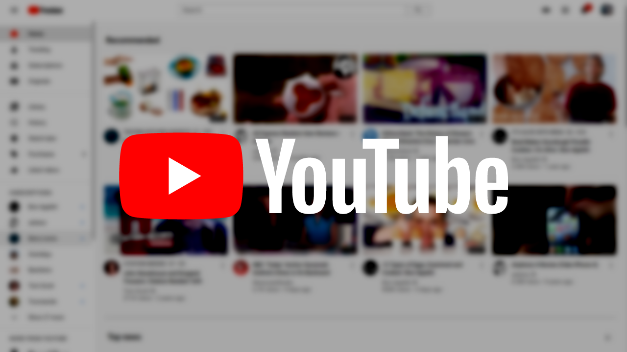
YouTube is once again given a fresh cell treatment that tidies up visually and brings new features. During the presentation, the developers are concentrating primarily on design updates for the mobile app, but also supply the web player and smart TVs.
17 years after the start, it’s time to clean up again
In the early days of YouTube in 2005, the site’s interface consisted of a search bar and a list of video tags. 17 years later, the platform looks significantly different and was primarily shaped by the rise of smartphones in its structure. Now Nate Koechley, the platform’s UX director, has presented an update that once again tweaks function and appearance – especially on the mobile version.

More colors, with better arrangement
The first adjustment that catches the eye is quickly explained: At the clear request of the community, the Dark Mode for YouTube is, according to its own statement, “much darker”. Above all, this ensures even more contrast between colors and interface elements. The adaptation will be available for web, mobile and smart TVs.

The update also brings new features that only appear in Dark Mode. According to YouTube, it was inspired by the glow of a screen in a dark room. The result: the new Ambient Mode ensures that the color of the video shines over the edge with a rather subtle effect. In tests, users have shown “overwhelmingly positive reactions” to the customization, it comes for the app and the web player.
YouTube also appears in a quite new guise for playlists. While a lot of information was previously cut off in the mobile view, significantly more details are now displayed. To do this, the arrangement of buttons is rearranged and the most important elements are given more space.
You Can Zoom Within The Video Player
In the case of the video player’s interface, on the other hand, the colors that have been customary up until now have been significantly reduced and the focus is on a subdivision using clear buttons. The important “Subscribe” element, previously placed as red text below the channel image, is now moved to the right as a white button with black text. Actions like “Like”, “Share” and “Download” get a unified look and slide down.

The video player then contains two new operating functions that Google had previously tested with its premium subscribers. Pinch-to-zoom now allows videos to be enlarged on smartphones in order to be able to see details better. The video then continues to play at the selected zoom level.

Last but not least, they want to make precise forwarding and rewinding much better – a task that could previously be frustrating, especially on mobile due to the very small timeline. After the update, you can swipe up on a search on mobile and desktop to see a series of thumbnails in the video player.
Research Snipers is currently covering all technology news including Google, Apple, Android, Xiaomi, Huawei, Samsung News, and More. Research Snipers has decade of experience in breaking technology news, covering latest trends in tech news, and recent developments.