Google Tv mobile app revamped with Material You theme
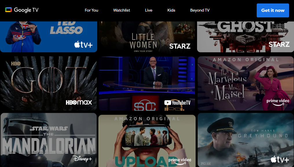
It seems like Google is ready to introduce the Material You design to the Google TV mobile app available on Samsung Galaxy and other Android smartphones.
Not long ago, Google introduced the Material You design to its many apps. These included Android Auto, Google Search, and Nearby Share. Google is now aiming to expand the new design to a new mobile app. Soon it is expected to introduce the Material You theme to the Google TV mobile app.
The new design of the Google TV mobile app comes with a new bottom bar. It is now tall. Additionally, it contains pill-shaped indicators. These indicators highlight the tab viewed at any given time. Furthermore, the menu bar is entirely revamped. Now the Search bar expands around the complete width of the mobile app. Well the moniker of Google TV stays at the center of the search field. It neither disappears nor shows hints in the search box as compared to other apps.
In addition to these, the search field is also provided with cast and profile buttons. Formerly it required pressing the magnifying glass or search icon at the top left for a search. Now, users can tap anywhere on the top of the search bar within the app and search their queries. Furthermore, rounded rectangles are provided for various elements of the Google TV mobile app.
Though, the color scheme of the app has been changed. But it misses out on the Dynamic color theme. In the app, the black colored background is changed to grey. The new Material You M3 navigation rail on tablets presents a unique look to the Google TV mobile app.
As of now, the Material You redesign of the Google TV mobile app is not available on a wider scale. To occupy all devices requires some time. Furthermore, it appears like a server-side update with version 4.37.20.
Research Snipers is currently covering all technology news including Google, Apple, Android, Xiaomi, Huawei, Samsung News, and More. Research Snipers has decade of experience in breaking technology news, covering latest trends in tech news, and recent developments.
